25%
Increase in services
300%
Growth in team size
40%
Increase in traffic
Reflections Management and Care is truly a business born out of love, empathy, and understanding. At the start, they were a team of just two individuals dedicated to the advocacy of seniors, and to assist them in maintaining their independence in their own homes. With over 20 years of experience, the duo had a formidable vault of knowledge in their field and a broad range of services, but they needed a helping hand to make those services accessible to clients and their families.

The focus when designing and developing Reflections’ website was clear: ease of use. Information needed to be easy to acess, services needed to be clear, and navigation straightforward. With that being said, it was also important to me that the site had a cozy, comfortable feel to it; clientele were often going through difficult, uncertain periods in their lives. Reflections had to reach out through that and be a reliable hand to guide them through. So, with accessibility and comfort in the forefront of my mind, we launched in to branding.
- New Branding
- 2. Accessible Site
- 3. Proof
Calligraphy has long since been commended as classical, harmonious and functional, and for the mood of the business, it was an excellent fit. After choosing an easily legible heading font, we didn’t want to stray too far from the tried-and-true leaders in accessibility. With icons like Arial, there was no need for us to reinvent the wheel in this situation.
We created three staples- one in color, one in white, and one in black.



For the site’s palette, we elected to use a soft, muted blue-green paired with varying shades of gold. While the bulk of the layout utilized the former, that left the golds even more eye-catching as CTAs and accents.
- New Branding
- Accessible Site
- 3. Proof
Once we’d ensured the colors and fonts across the site fit the tone and clientele, we were ready to design the layout and components.
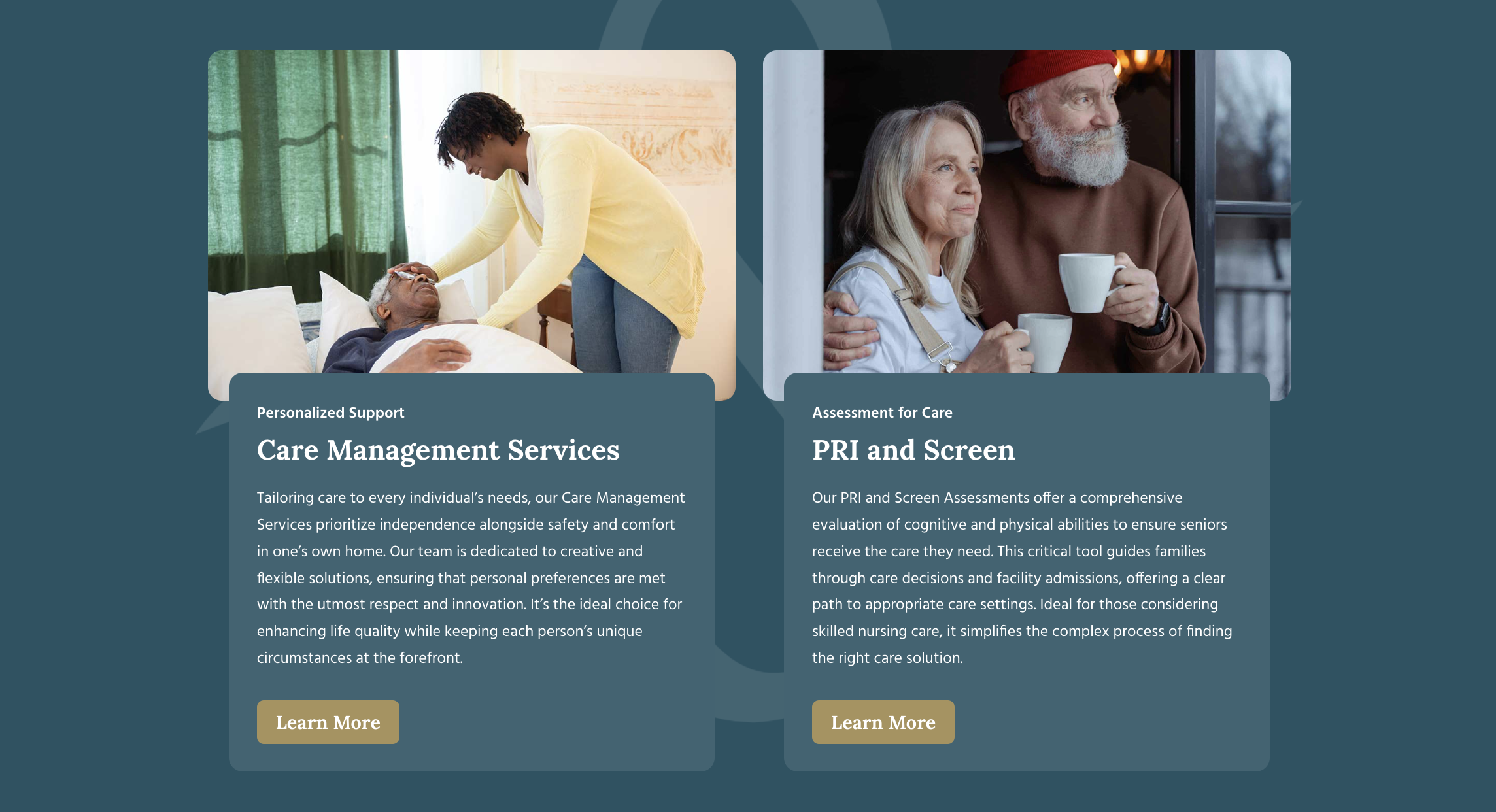
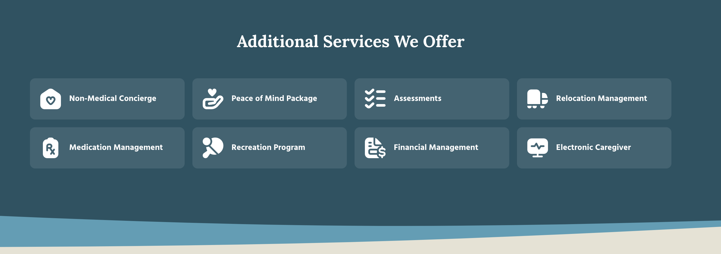
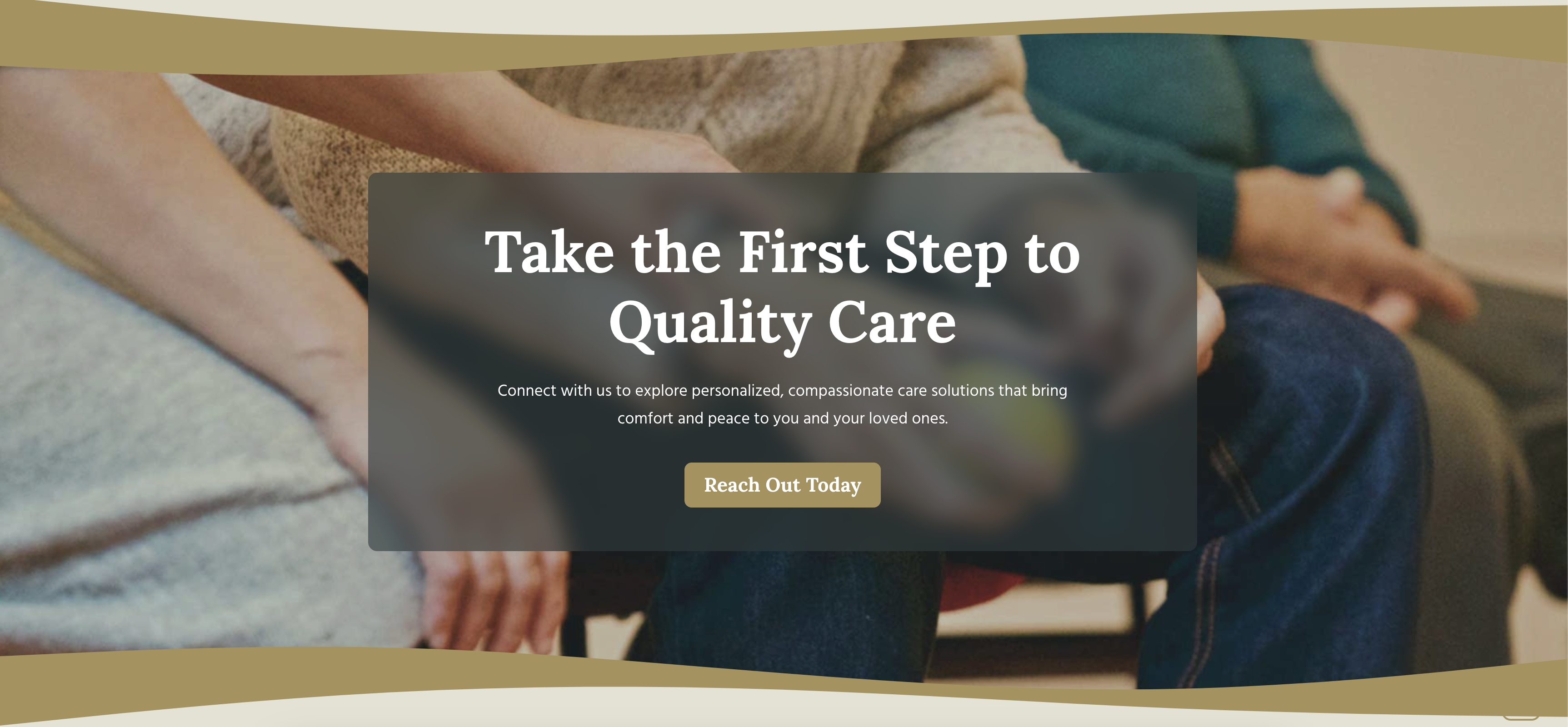
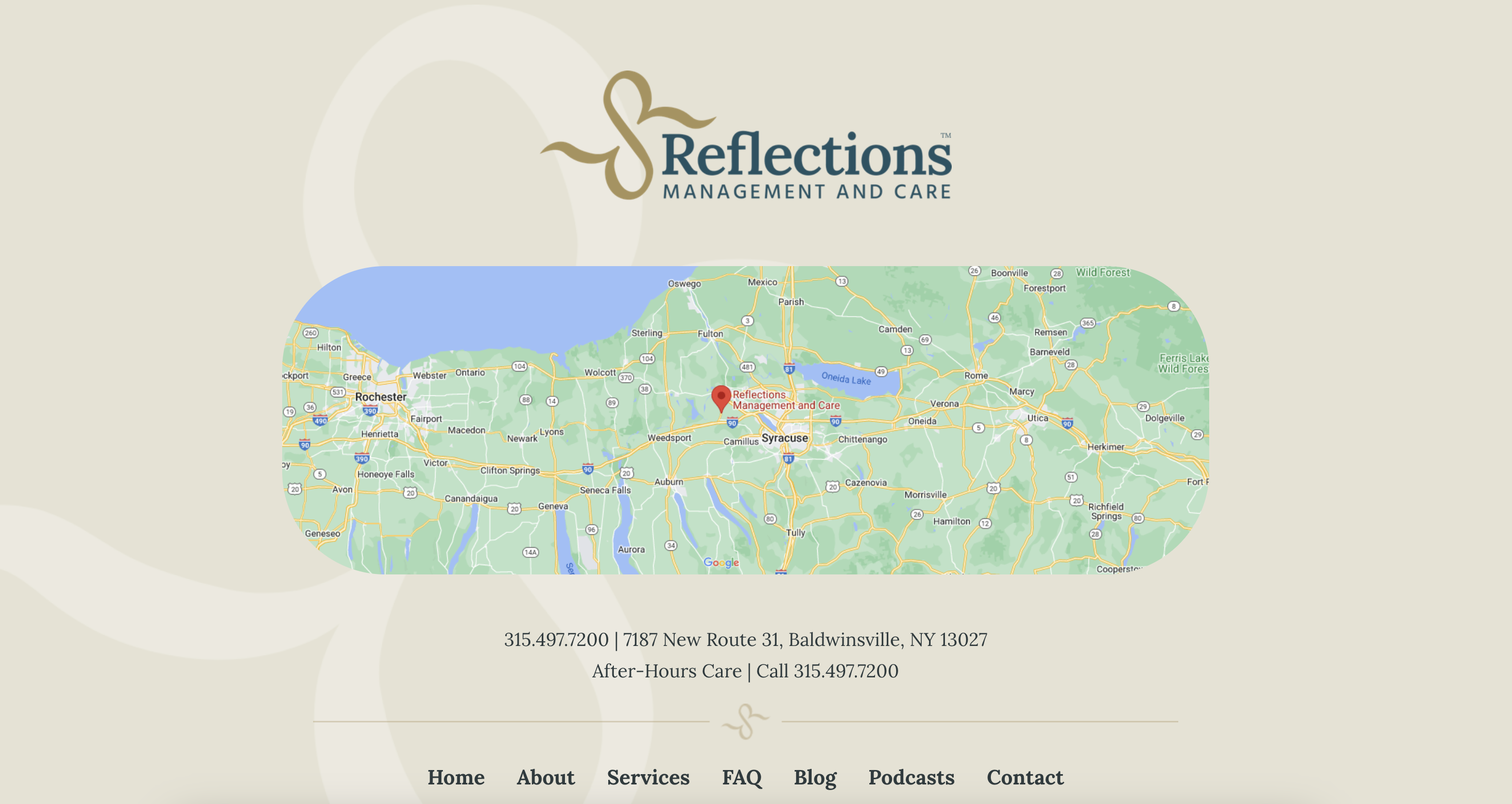
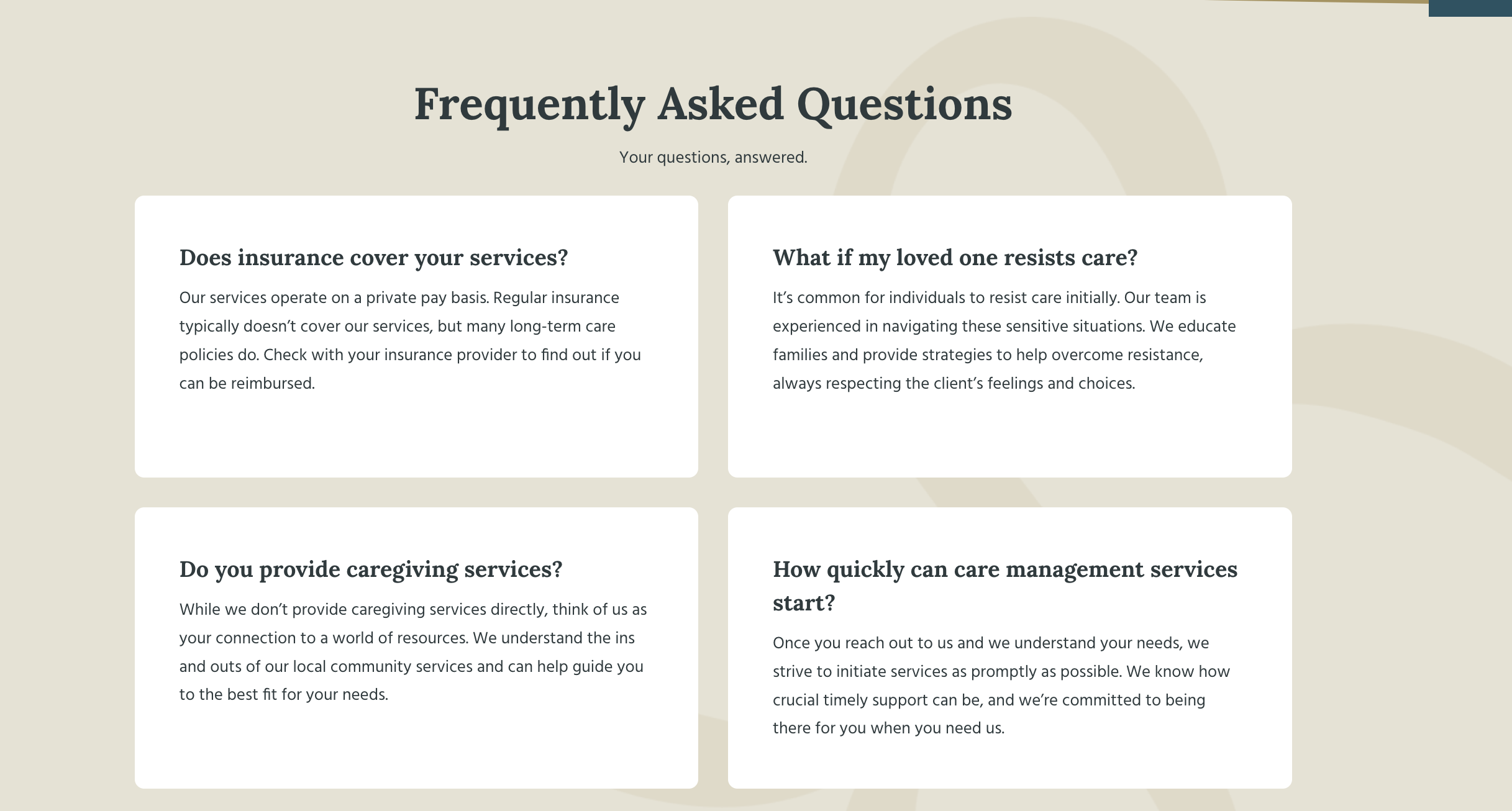
On every service section, a comprehensive breakdown of services and set of frequently asked questions are included. Mega menus drop down to list out all services, as well as sections on the landing page. All typefaces were set to a large size for easy reading, and colors include enough contrast to be comfortably viewable.
Reflections’ ampersand logo element was utilized at a low opacity in many areas across the site to add visual interest and brand recognition, and all imagery used was chosen with a warm, positive mood in mind.
- New Branding
- Accessible Site
- Proof
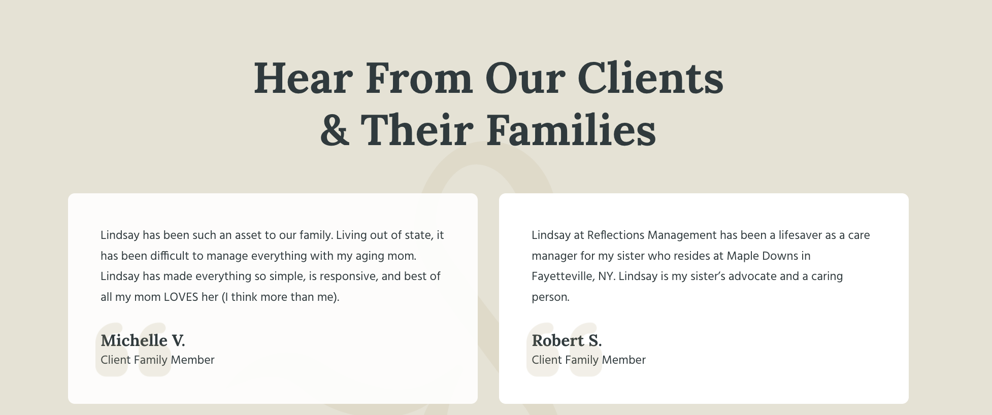
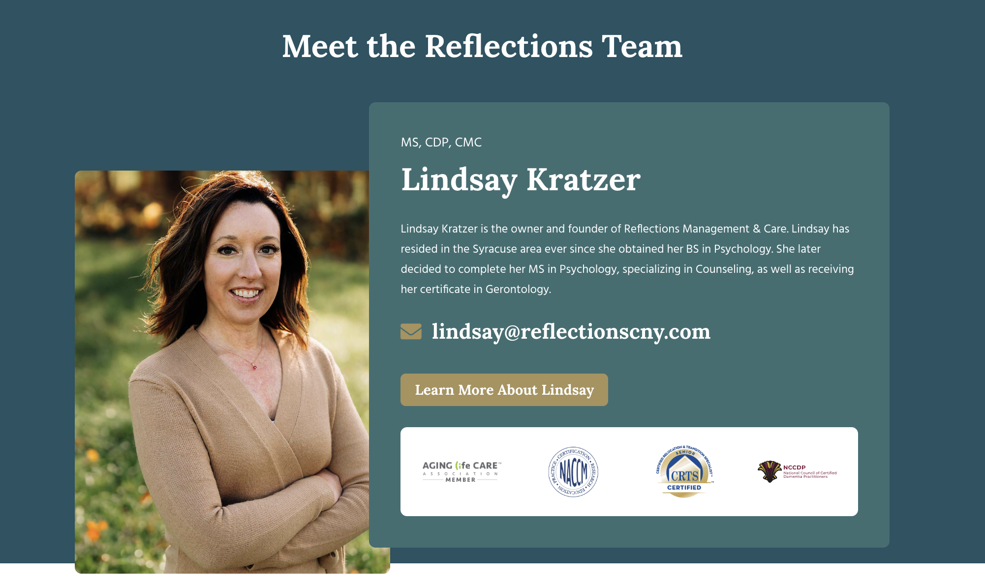
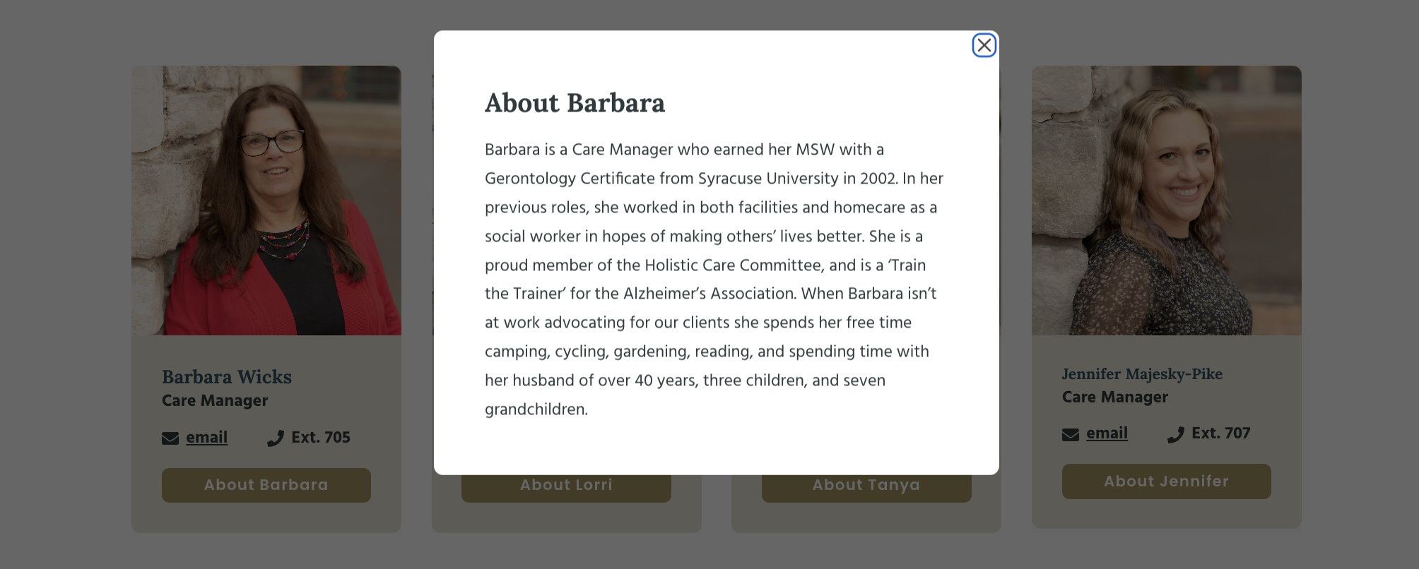
Part of ensuring Reflections was understood as a reliable support in uncertain times was including social proof. Testimonials were the primary means we used, along with comprehensive biographies for key members and avatars of everyone on the team. Putting faces to names creates a connection stronger than simply putting text on a screen.
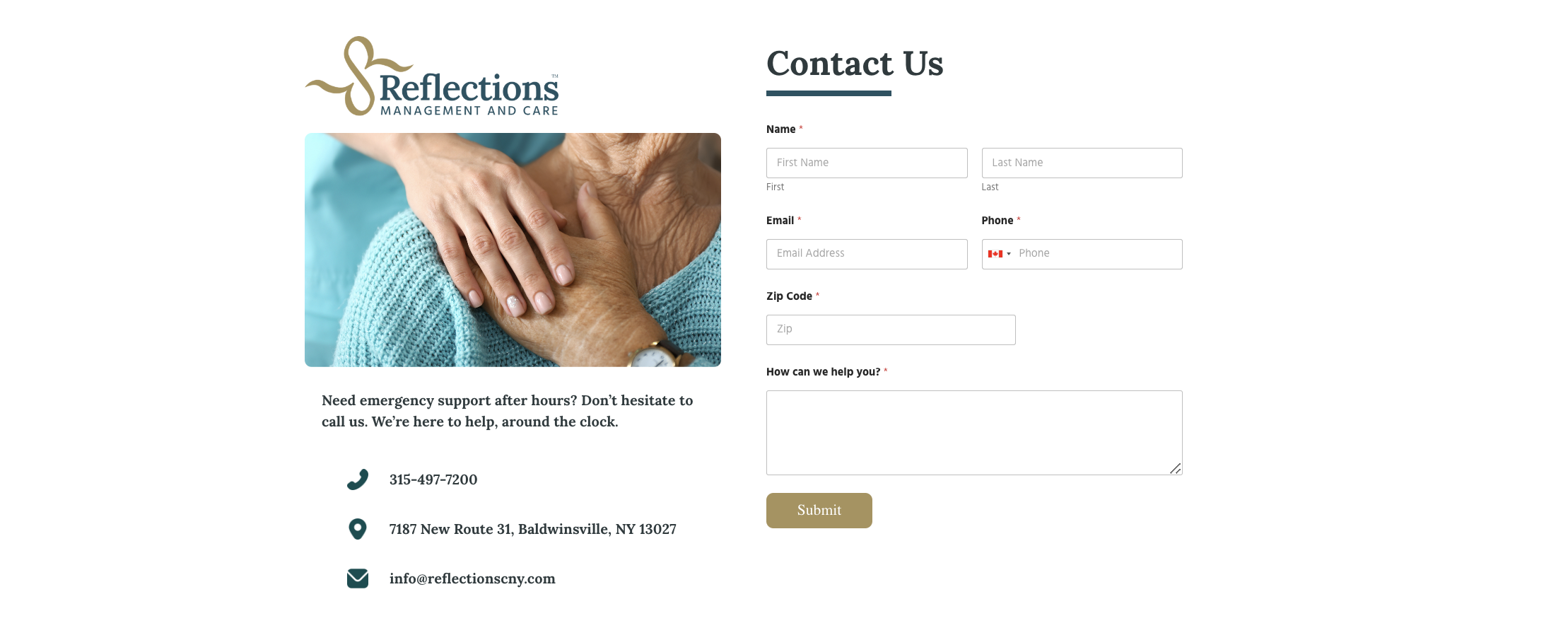
Modules were included for each team member, and company accolades are present on every page of the website. Finally, a contact page including extra information and after-hours service were featured.
