Kirshenbaum is a family owned and operated bakery that experienced viral fame shortly after opening. Following a rocky initial website launch, they reached out and contacted our team to start from the ground up.
KBC had multiple needs. Firstly, their website had to be fun, warm, welcoming and appealing- a space that felt like home despite being in the center of a major city. Secondly, and perhaps even more importantly, they needed menus and shopping options that were straightforward and encouraged visitors to place orders from anywhere in the country. As it stood, their branding was inconsistent, and they were unable to create effective shipping with low costs. While busy enough as a duo of two running a popular bakery, it was vital that they could hand everything over and receive a high-standard end product that fulfilled all of their requirements.
- New Branding
- 2. Welcoming Site
- 3. E-commerce
While their core ideas were excellent, KBC needed some assistance with cohesiveness and a unified brand image. It was important to use the pre-existing style that lined up with their physical storefront, but also to make something that was eye-catching on a website. Their branding additionally had to be something that was easy to tweak for their products, including packaging, cup sleeves, and more.
This landed us with three main variations- our main colored version, one in black, and one in white.


KBC has since successfully used and reused their logos for their wide range of products, as well as for the sign of their multiple storefronts. The core elements were also our basis for brand guidelines that we were able to use all across their new website.
- New Branding
- Welcoming Site
- 3. E-commerce
With our guidelines in place, we were able to move into the bulk of the project- the website itself. When creating each individual component, at the forefront of my mind was to ensure it felt both cozy and playful. Their story and business evoked a sense of family fun, and it was important to me that everything we created for them was a reflection of that. From little details sprinkled throughout, to pieces of the Kirschenbaum’s own story, everything was crafted with attention and care.


The cherry element was used as a prefix to many headings, both for personality and to hint at taste, as was the case with many pieces we used. Small variations on the primary red accent kept it versatile enough to be used against dark and light backgrounds, repeated in most buttons and links across the site. Vital information such as location and business hours were also spread out, to keep that information as accessible and memorable as possible.
- New Branding
- Welcoming Site
- E-commerce
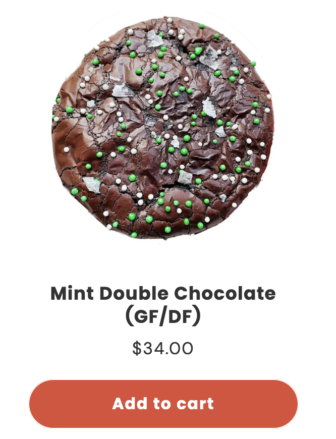
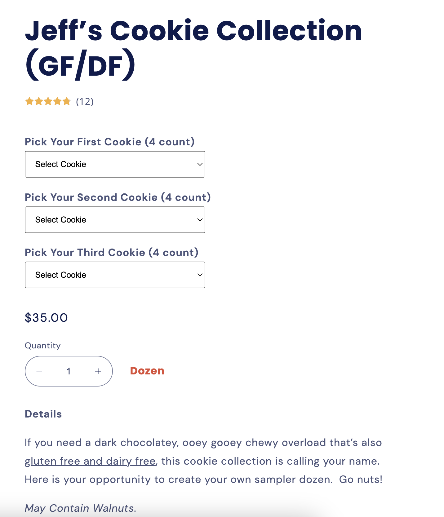
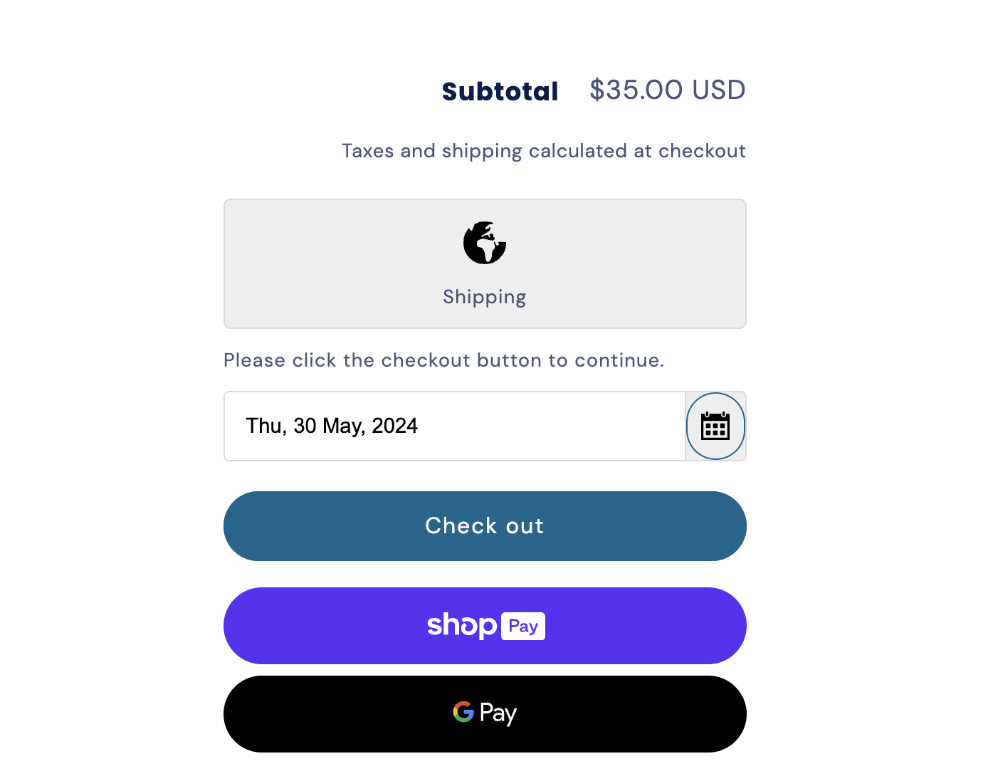
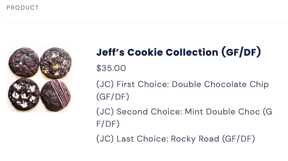
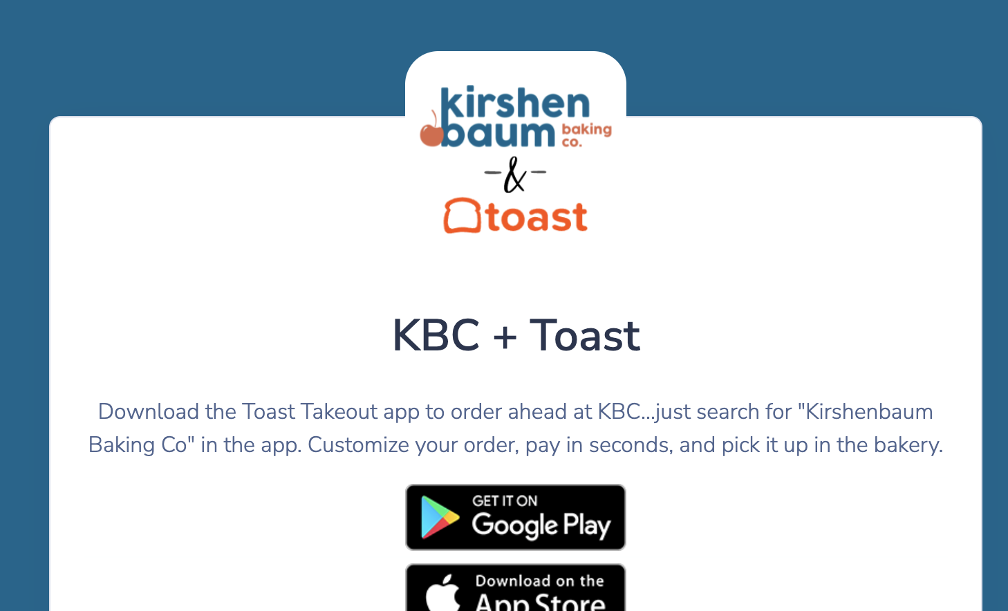
There were two main parts needed for KBC’s e-commerce; a local ordering option, and nationwide shipping functionality. To make this as painless as possible for them and their customers, we elected to integrate their pre-existing local service, Toast. With tweaks and customizations made to their menu and layout in Toast, we could focus our full attention on building their shipping across the US from the ground up.
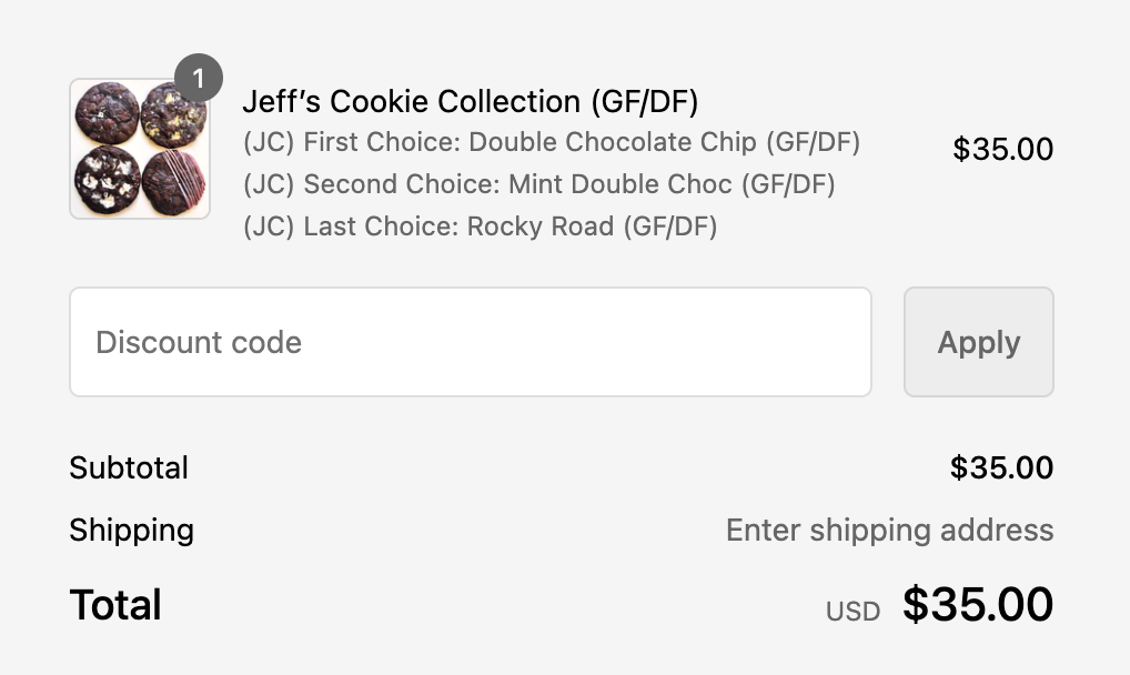
For the most capabilities, we decided to use Shopify, creating a cohesive set of pages we could link within a dropdown menu. We were given a set of high-quality images to populate every item, letting everything else take a back seat to the products themselves.
