With the initial request from Shaun Jones to create an efficient, attractive website for financial professionals and clients alike, I was excited to fully invest in a brand new challenge. Every project comes with its own set of unique requirements, but this one in particular needed careful planning and care.

Jones’ new website needed to provide a seamless transition from prior hosting, where clients were able to access a variety of portals. Additionally, special focus was going to be given to Jones’ recently published book, bringing attention to its release and what it could provide. Post-launch, Jones would request an expansion of his site to encompass the field of real-estate he’d branched into, and finally, as with any project, bringing in new clientele was essential.
- Modern Design
- 2. Easy Integration
- 3. New Content
With a pre-established logo in existence, our main design focuses were on palette, core components, and organization of information in a way that made sense and wasn’t overwhelming for readers. Blue was our ultimate choice for core color, for both its usage in Jones’ book cover, and its fresh, futuristic feel.
The versatility of it worked to our advantage, allowing us to use variations where needed without muddling up the overall design.

The color envokes trust, efficiency and intelligence, and when paired with images of high-speed tech and well-made charts, the effect really shines through. Crisp white icons and text against the darker blues help to draw the eye to important elements, and we break it all up in chunks of digestible information, with the intent to minimize eye fatigue and maximize visual interest.



- Modern Design
- Easy Integration
- 3. New Content
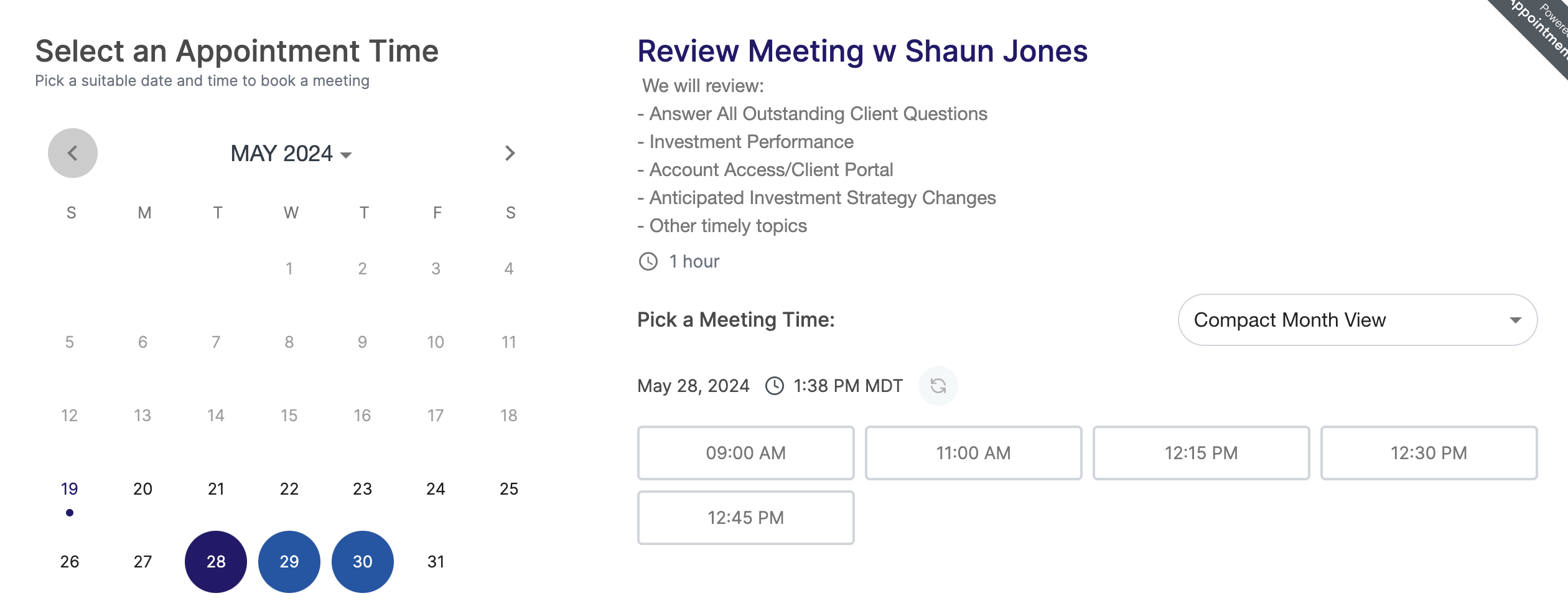
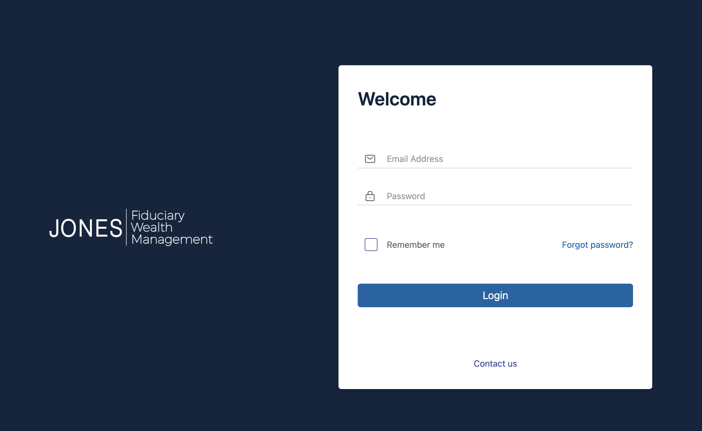
Jones’ services included a number of different portals, where clients could access their accounts, funds, and schedule various types of meetings. Allowing clients to continue usage without risk of confusion or delay was a non-negotiable, which meant adapting to the new design without shaking things up too much. This led us to use pre-existing integrations where layouts would be the same for all practical purposes, with adjustments made where necessary on purely a design level to coordinate with the new look.
Integrations were made with Advyzon, AppointmentCore, eMoney, and AltPro.


- Modern Design
- Easy Integration
- New Content
As I mentioned in the overview, Jones’ book, UnBrainwashed Investing had just recently been published. While being a secondary offering from his overall customer services, it was nonetheless a great achievement and an important inclusion on his website in its own right. I strived to give it an almost separate space, a dedicated page where it could singularly shine, while also adding in mentions and reminders in other areas as tie-ins where it made sense.
The end result was a sort of miniature landing page of its own, giving it the space to show quotes, links, and information on the book’s intent and purpose as a whole.


